
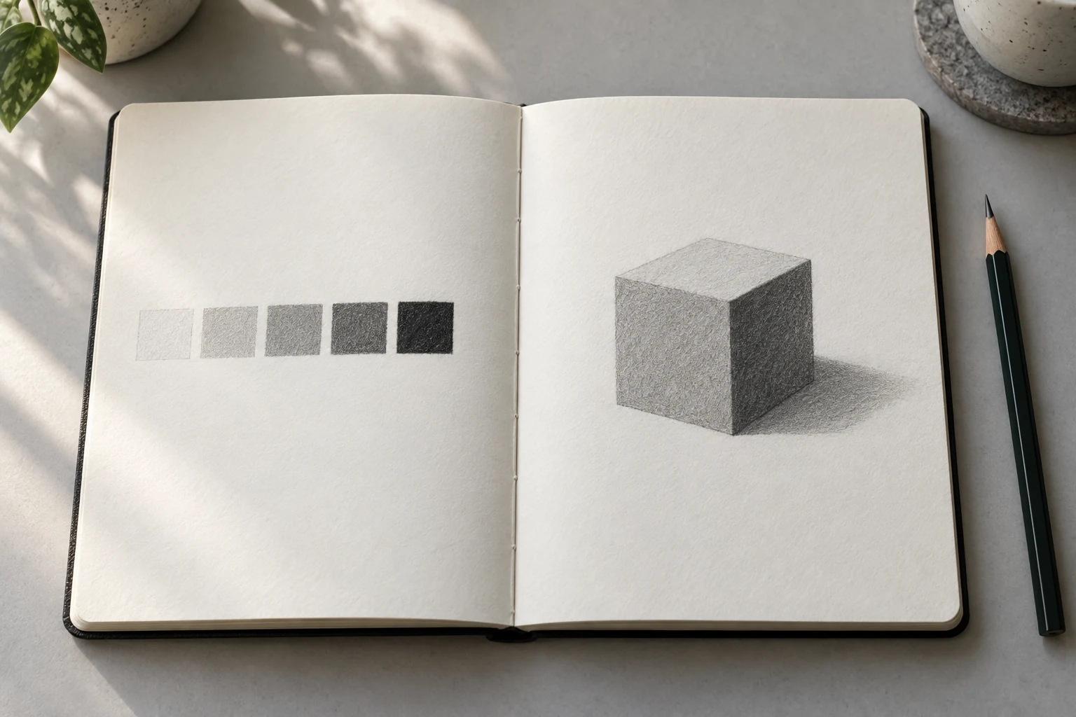
A pencil drawing can feel flat when every part has almost the same darkness. Before adding detail, students can practise distinguishing values. Here, value means how light or dark an area appears compared with another area.
A five-square exercise makes these differences visible. One available pencil is enough to start. The purpose is observing relationships rather than achieving a particular black through identical pressure for everybody or finishing each square within a fixed time.
Prepare areas that are easy to compare
Use white paper and a familiar graphite pencil. Draw five simple squares of similar size in one row. Leave space around them so the eye can compare their contents without many other drawings competing for attention.
Keep one square as untouched white paper. It provides the lightest comparison in this exercise. Avoid covering every area immediately, because students would lose a reference for judging the next light layer.
Try some strokes separately before filling the squares. Observe how the pencil moves and the paper texture appears. There is no need to change tools because results differ from the example; use available materials to create readable distinctions.
Make five squares with different values
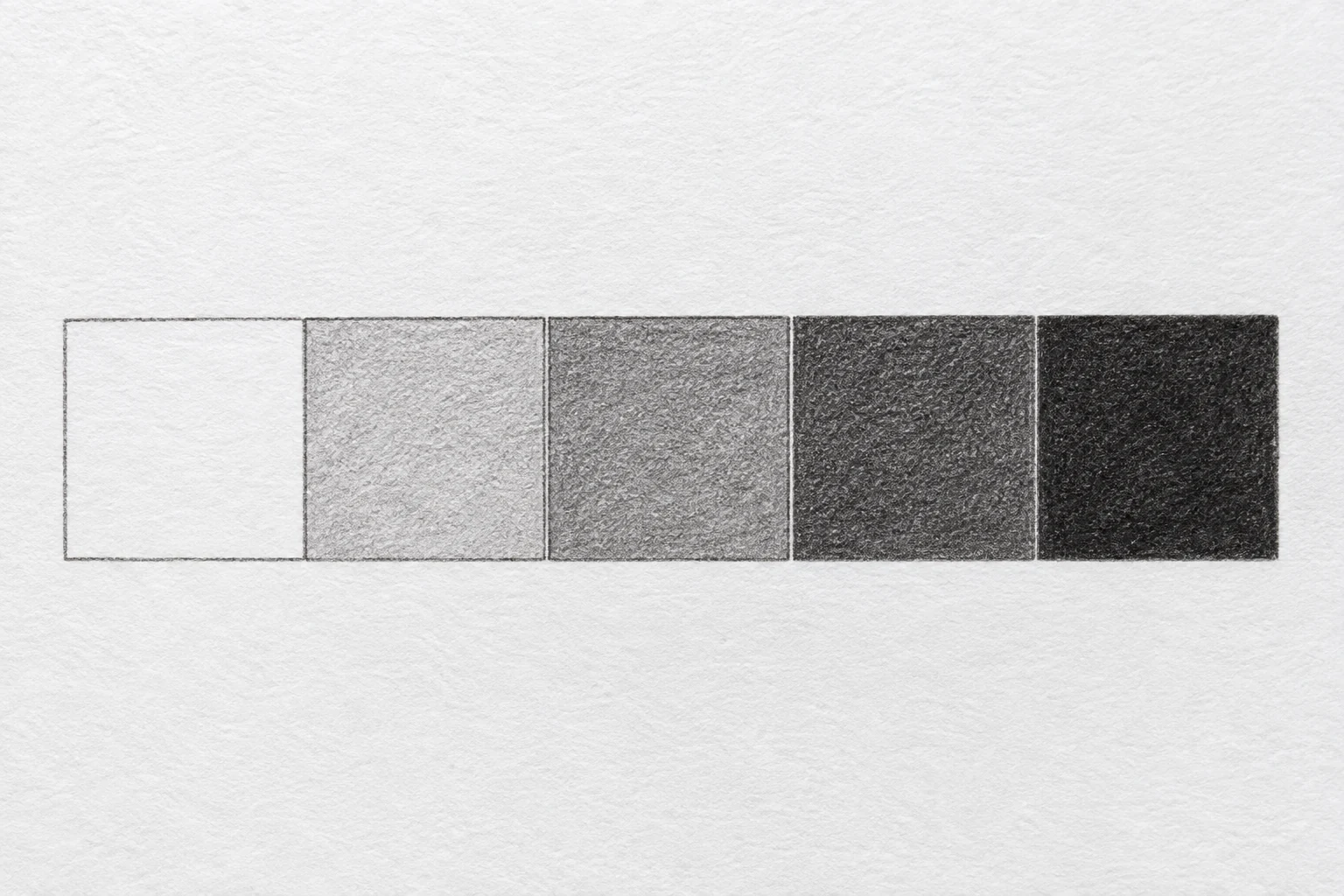
Leave the first square white. Shade the second lightly, the third more densely, and continue to two darker values. Add layers gradually so students can see differences before deciding whether more graphite is needed.
Give each square one main value rather than a left-to-right gradient inside it. The row compares five value groups. Strokes may remain visible; the surface need not be perfectly uniform to explain light-and-dark relationships.
The darkest square follows the pencil and paper’s capabilities. Avoid chasing darkness through excessive pressure or surface damage. Clear differences between adjacent squares are more useful in an introductory exercise than one very dark square and four nearly identical ones.
Check differences between neighbours
Look at two adjacent squares. Can the eye distinguish them without pointing to their boundary? If two are nearly identical, choose one to adjust. Add a small layer and compare again before continuing.
Ask which square sits between white and the darkest value. This helps students understand relative relationships. There is no need to treat results as measurement numbers; the five squares support drawing decisions.
View the row from a comfortable reading distance as well as close up. Texture can appear strong nearby while value groups remain difficult to distinguish. Check both how strokes look and how areas read as groups.
Apply three values to one shape
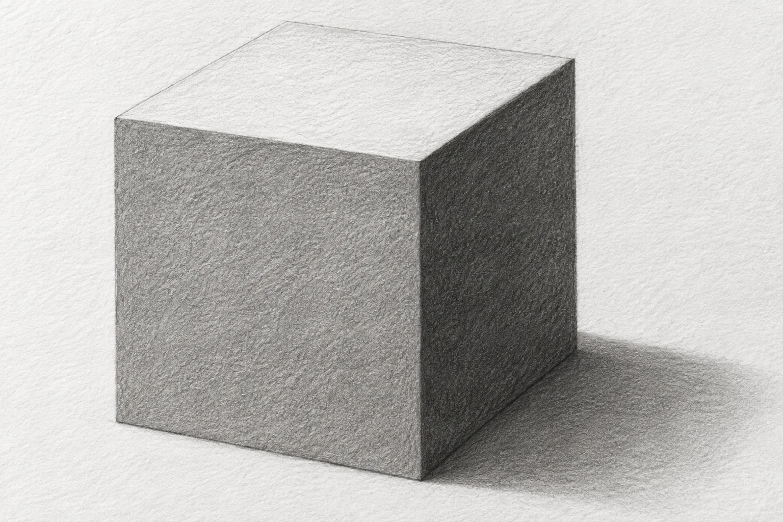
Draw a simple cube with three visible planes. For this example, imagine light coming from the upper left. Choose a light value for the top, a middle value for the front, and a darker value for the right side.
Start with large groups without small textures. Compare the planes with your new scale. Students need not use all five values in one drawing; the scale offers choices while this example distinguishes three main planes.
Add a cast shadow if useful for showing the shape’s relationship to its surface. In the example, it falls toward the lower right, following the chosen light direction. If choosing another direction, adjust planes and shadow together rather than moving only one part.
Distinguish shape boundaries from value boundaries
Notice whether the cube reads mainly through heavy outlines or differences in shading. Lines can help build the shape, but this exercise explores value. Avoid automatically thickening every edge when planes feel insufficiently separated.
Compare two meeting sides. If their values are too similar, adjust the shading groups gently. Preserve the established outline during comparison so students can explain that the difference comes from value rather than a newly sized cube.
Small mistakes can become notes for the next decision. The front may need to be lighter, or the shadow may look too similar to the right side. Choose one explainable change rather than trying to repair the whole drawing simultaneously.
Keep the scale for subsequent practice
Place the scale near drawings of other objects. Students can try one object in three approaches and use value groups for light and dark areas. The observed object’s conditions remain the main reference.
Write one finding: which value was easy, which two squares were hard to distinguish, or which change helped the cube read clearly. A brief observation is more useful than only judging whether the result looks good.
Bring the scale and its application to a Zumenart mentor. Together, they show concrete choices to discuss. Future exercises can follow student needs through regular art practice without requiring the same shape every time.