
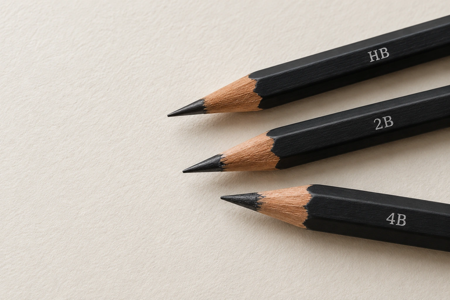
HB, 2B and 4B pencils offer different drawing characteristics. In general, a higher B number indicates softer graphite within a grading system. The mark on paper also depends on pressure, surface texture, point shape and layering.
Rather than immediately choosing one pencil as the best, make a small comparison under controlled conditions. Then use all three on the same form. This helps reveal when a pencil’s behaviour supports a drawing goal instead of merely memorising a dark-to-light order.
Prepare a fair comparison
Use one sheet so the surface texture does not change during the test. Choose clearly identified pencils and, where possible, use the same product series. Comparing brands is possible, but the outcome then reflects more than the grade numbers alone.
Draw three equal areas and label them HB, 2B and 4B outside the drawing spaces. Sharpen the points to comparable conditions. A very blunt point on one pencil and a very sharp point on another can change the line width independently of the grade.
The STAEDTLER graphite-pencil range shows hardness grades for different applications. Treat the markings as a starting point, then observe the actual tools available. A grade does not guarantee an absolute grey value across every brand and paper.
Compare strokes under the same conditions
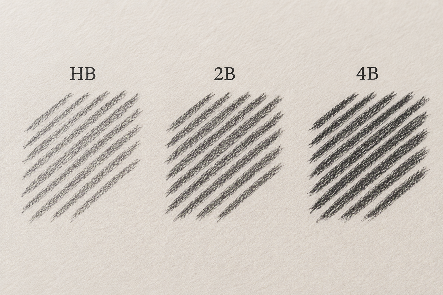
Fill each area with a similar direction, length and number of strokes. Keep hand pressure comparable instead of pressing harder to make one box darker. Pause briefly if your pressure begins changing without deliberate control.
Observe three things: darkness, stroke width and how much paper texture remains visible. Write a description such as “builds a dark area more easily with light pressure” rather than only “this pencil is better”. The description connects the tool to an action.
Add a second layer to part of each box. Compare its effect without erasing the original test. The aim is to explore layering, not force every pencil to reach the same black through excessive pressure.
Try all three on the same form
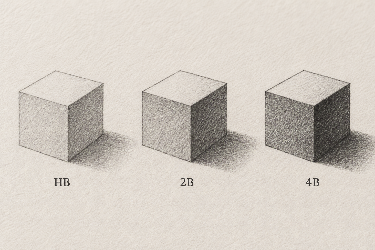
Draw three simple cubes with the same size and light direction. Use HB for one, 2B for the next and 4B for the last. Keep light, middle and dark planes on corresponding sides so the comparison remains readable.
Do not improve the shape only in the final cube. If proportions differ, the viewer will compare shape drawing rather than pencil characteristics. A shared light framework can help maintain consistent size and position.
Begin each drawing lightly and build the dark area gradually. Notice whether more layers are needed or pressure needs reducing. A soft pencil can still produce a light mark; a B number is not an instruction to make the entire drawing dark.
Select roles rather than a winner
HB may suit controlled initial lines, while softer B grades may help develop dark areas. These are possible uses, not compulsory assignments. Hand habits and the intended result still influence the choice.
If only one pencil is available, explore pressure and layering with it. There is no need to postpone practice until a complete set has been purchased. Comparing three grades helps explain options, but it is not a prerequisite for drawing.
When combining grades, try a small area first and observe whether the transition suits the image. Grade numbers cannot resolve a light direction that remains unclear. Establish the form’s lighting before expecting a different pencil to improve it.
Notice hand contact and surface effects
Graphite can transfer when a hand or object touches an already drawn area. Watch hand position as you move between sections. A clean protective sheet may help, provided it is not rubbed across the entire drawing.
Observe paper effects as well. Different surfaces can change texture and stroke response. In a later test, change the paper while keeping the pencils and stroke method comparable. One deliberate change remains easier to interpret than several simultaneous changes.
Keep the comparison sheet as a personal practice reference. Note the paper and pencils used. It is more useful than remembering that 2B “always works” without knowing the conditions in which it felt comfortable.
Continue with value decisions
After exploring the three pencils, use the five-value graphite scale to organise differences in light and dark. Tool comparison and value organisation support each other while answering different questions.
For the next sketch, identify the lightest and darkest areas before adding extensive detail. Select a pencil that makes those relationships comfortable to control. The choice can follow the drawing rather than a fixed rule about which grade an artist should always use.
Visit Zumen for drawing activities within a more structured learning context. For independent practice, one clearly controlled sheet already provides useful knowledge: how each pencil behaves in your hand on the paper you actually use.