
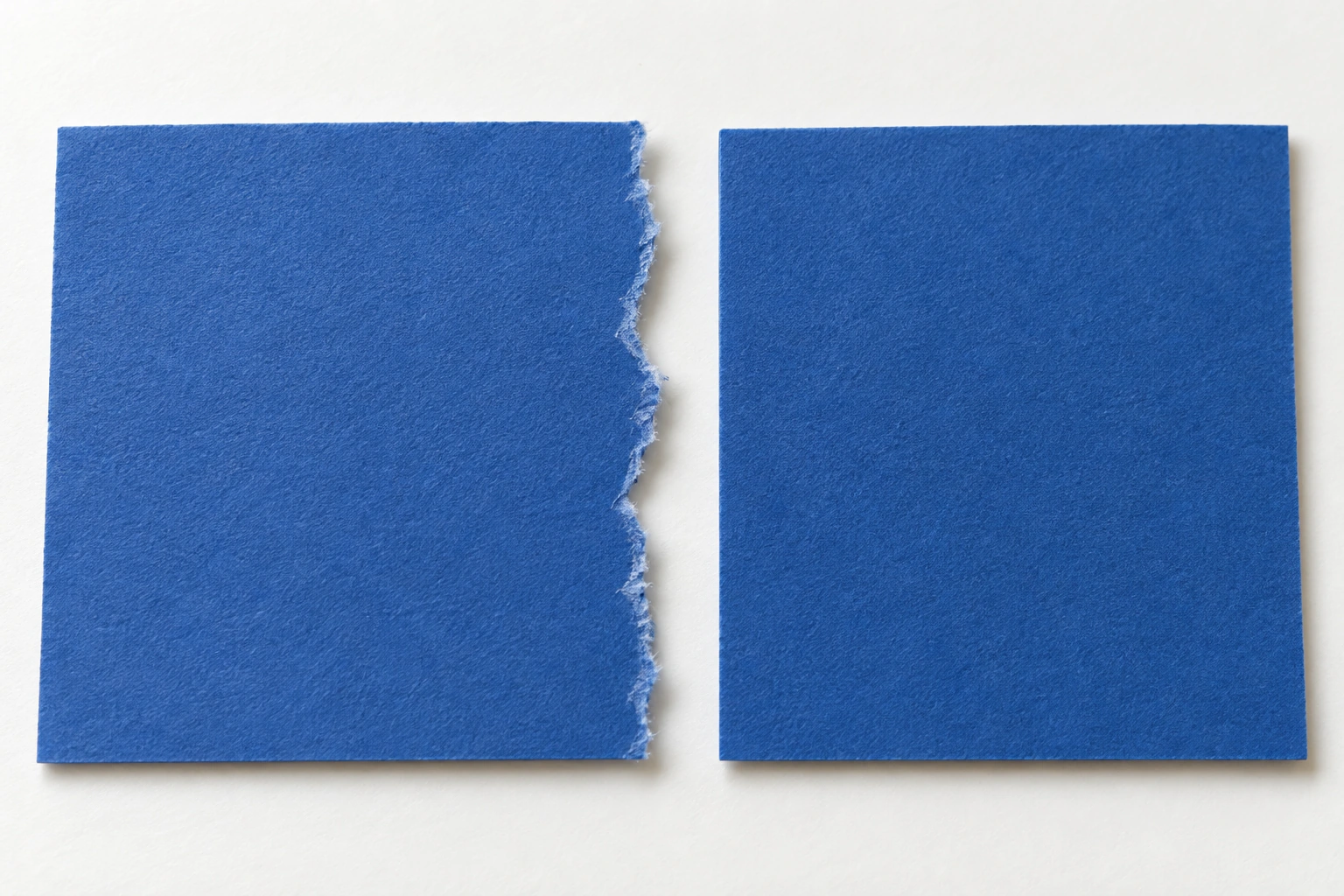
Torn and scissor-cut paper edges give a collage different characteristics. Tearing can expose fibres and an irregular boundary, while scissors offer more controlled edges. To judge their influence, compare them using the same material and arrangement before changing colours or shapes.
This exercise uses two equally sized backing sheets, coloured paper from the same sheet, suitable scissors and glue. Its purpose is not to decide that one technique is always better. You will observe how the edge changes attention, relationships between shapes and the impression of surface texture.
Compare edges on the same paper
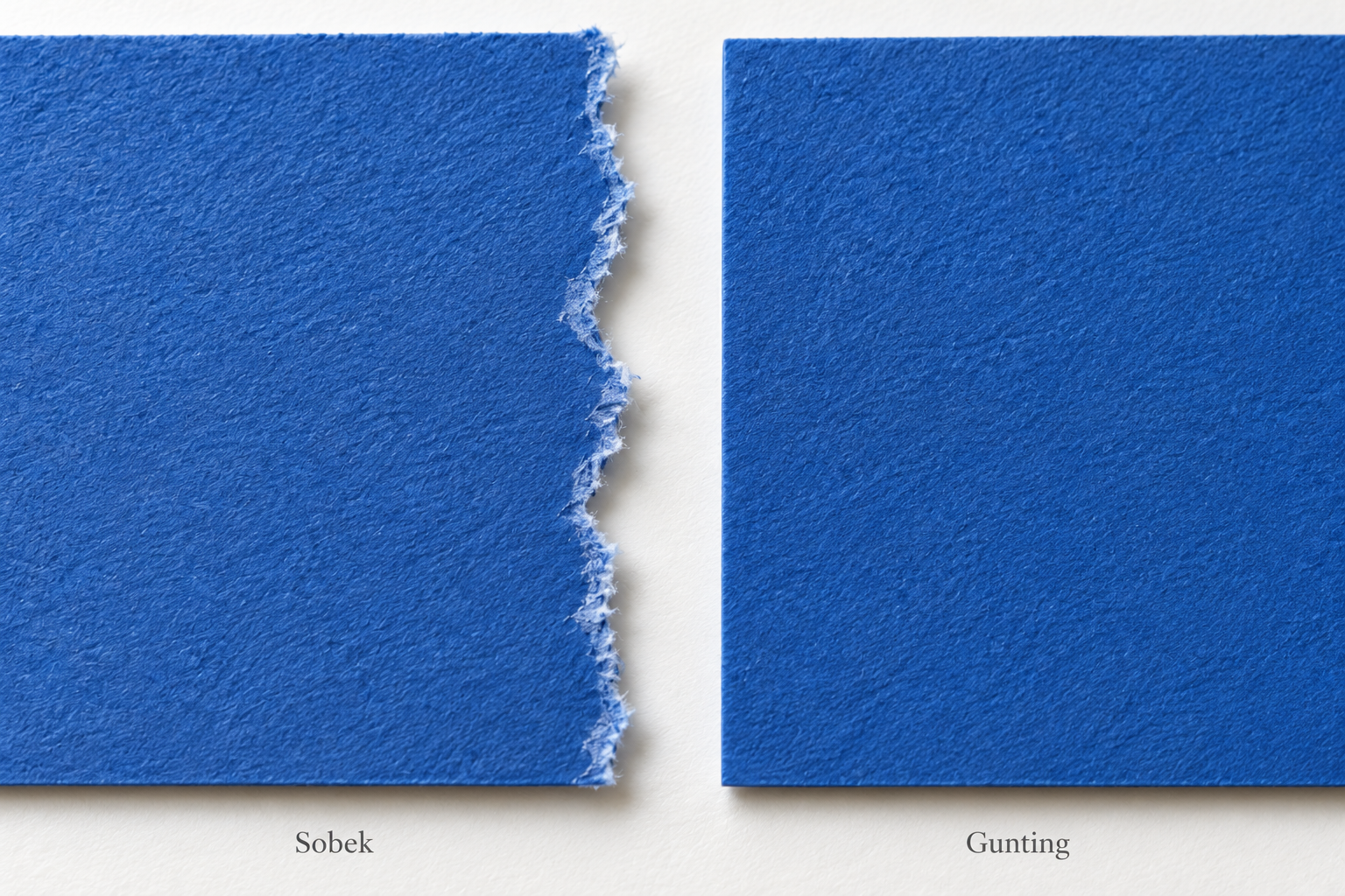
Take two pieces from one sheet. Make one edge with scissors and another by tearing. Place them beside each other on the same background, then examine the boundaries close up and at a normal viewing distance. A detail that is interesting nearby may become less noticeable when the whole work is seen.
Look for exposed fibres or a pale inner layer along the tear. Results depend on the paper, so do not assume that every tear creates a white edge. Paper coloured throughout may behave differently from a printed magazine page.
Collage artist Megan Coyle discusses torn and cut edges in her abstract-collage techniques. Use your own material comparison to decide which qualities to retain. A controlled cut and an irregular tear can both be deliberate choices.
Establish the large shapes first
For tearing, hold the paper near the intended separation and work gradually. Practise on a scrap before making the main shape. Notice how the pulling direction affects the edge without expecting a hand movement to produce precisely the same result every time.
For cutting, begin with a simple shape that does not require many abrupt changes of direction. Turn the paper as needed and use age-appropriate tools and support. Avoid choosing tiny, intricate shapes while the purpose is still to compare boundary character.
Make three broad shapes: a large area, an elongated piece and a smaller focal piece, for example. Preserve their number and relative sizes across both versions. If one version contains more pieces, you will be comparing more than one change at once.
Repeat one layout with two edge treatments
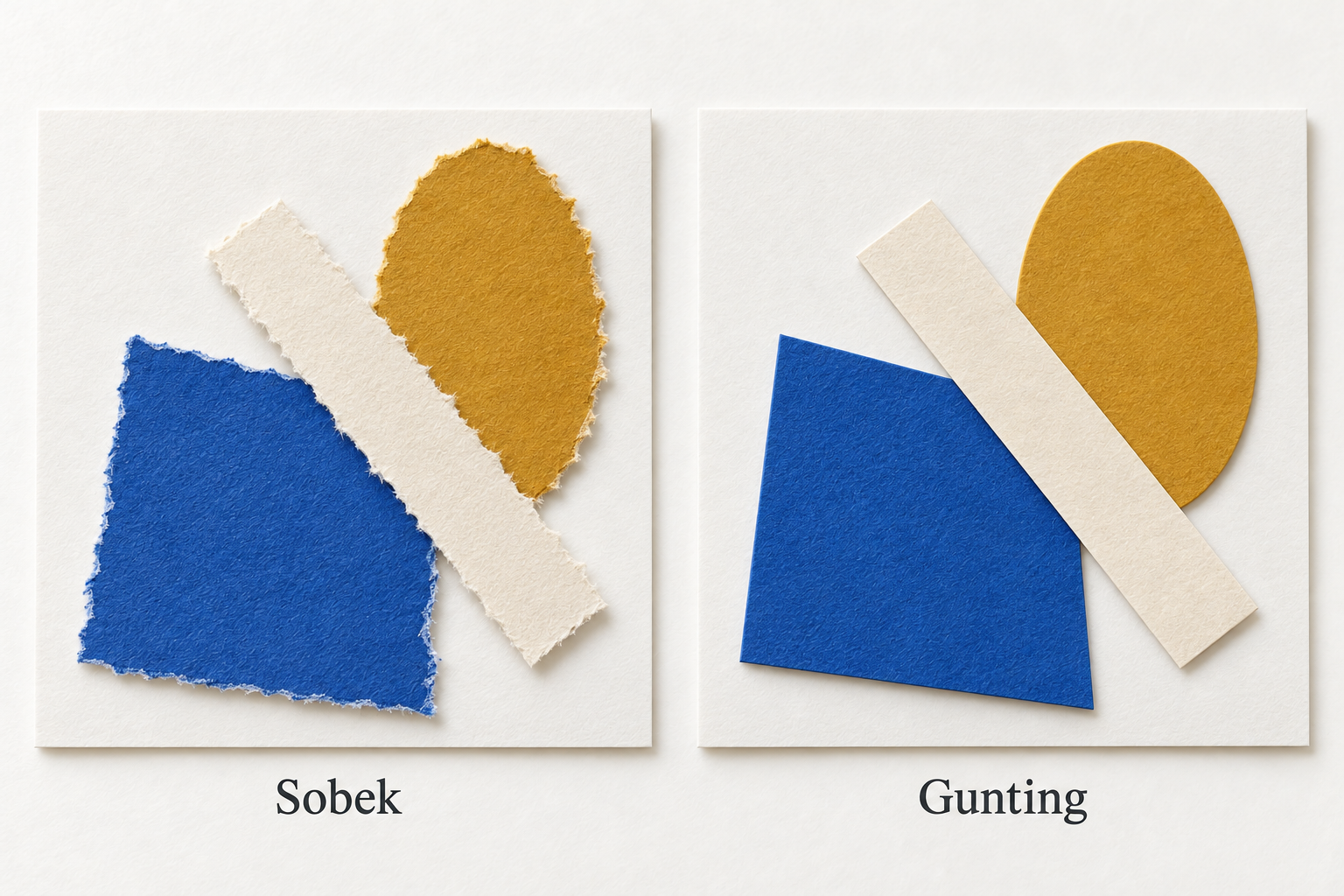
Arrange the first version without glue. Establish the positions, directions and overlaps of the three shapes. Once the composition reads clearly, repeat it on the second backing with similar sizes and positions but the other edge treatment.
There is no need to force a torn shape into a mechanical copy of a scissor-cut piece. Match the larger structure: which shape dominates, which sits in front and where the largest empty area falls. That similarity keeps the comparison focused without suppressing the material’s natural variation.
Photograph both arrangements before gluing if you want a reference for later changes. Attach the pieces using an appropriate amount of glue according to the material instructions, then let them dry. Keep the gluing method consistent so buckling or glue residue does not become the main difference you observe.
Read the edge as part of the composition
View both works from the same distance. Does your eye stop at a particular ragged boundary? Does a clean cut make a shape read more firmly? Describe a visible relationship rather than simply rating one version as good and the other as less successful.
Also consider contrast against the background. A pale inner edge on printed paper can create an extra bright line. If it appears, ask whether it supports the focal area or competes with it. You can choose another paper for a later experiment, but retain the first comparison before changing materials.
If the difference is difficult to read, use two plain cards to temporarily cover the work until only one meeting of edges remains visible. Compare that local relationship, then reveal the whole composition again. An edge can be interesting alone yet too prominent in the complete image. Alternating these views helps you decide whether to strengthen the effect, reduce it or place it elsewhere.
| Observation question | Relationship to compare |
|---|---|
| Which boundary is most prominent? | Edge against background |
| Which shape reads more clearly? | Unity of the broad silhouette |
| Does the surface feel different? | Visible fibres and irregularity |
| Where does the eye move? | Direction and meetings between areas |
Combine techniques for a clear reason
After making two separate versions, try a third that combines the treatments. You might use a cut edge for the main shape and a torn edge for a supporting area. Choose a location that benefits from the difference instead of adding torn details everywhere by default.
Write one sentence explaining that decision. “I used a torn edge in the background area to give its boundary more texture” creates an intention you can assess. If the result differs from your expectation, change one element and compare it with the original version.
To develop the front-to-back relationships, continue with paper collage and overlap. Keep noticing how edges operate within the arrangement. A technique becomes useful when you can explain its influence on the work you actually made.