
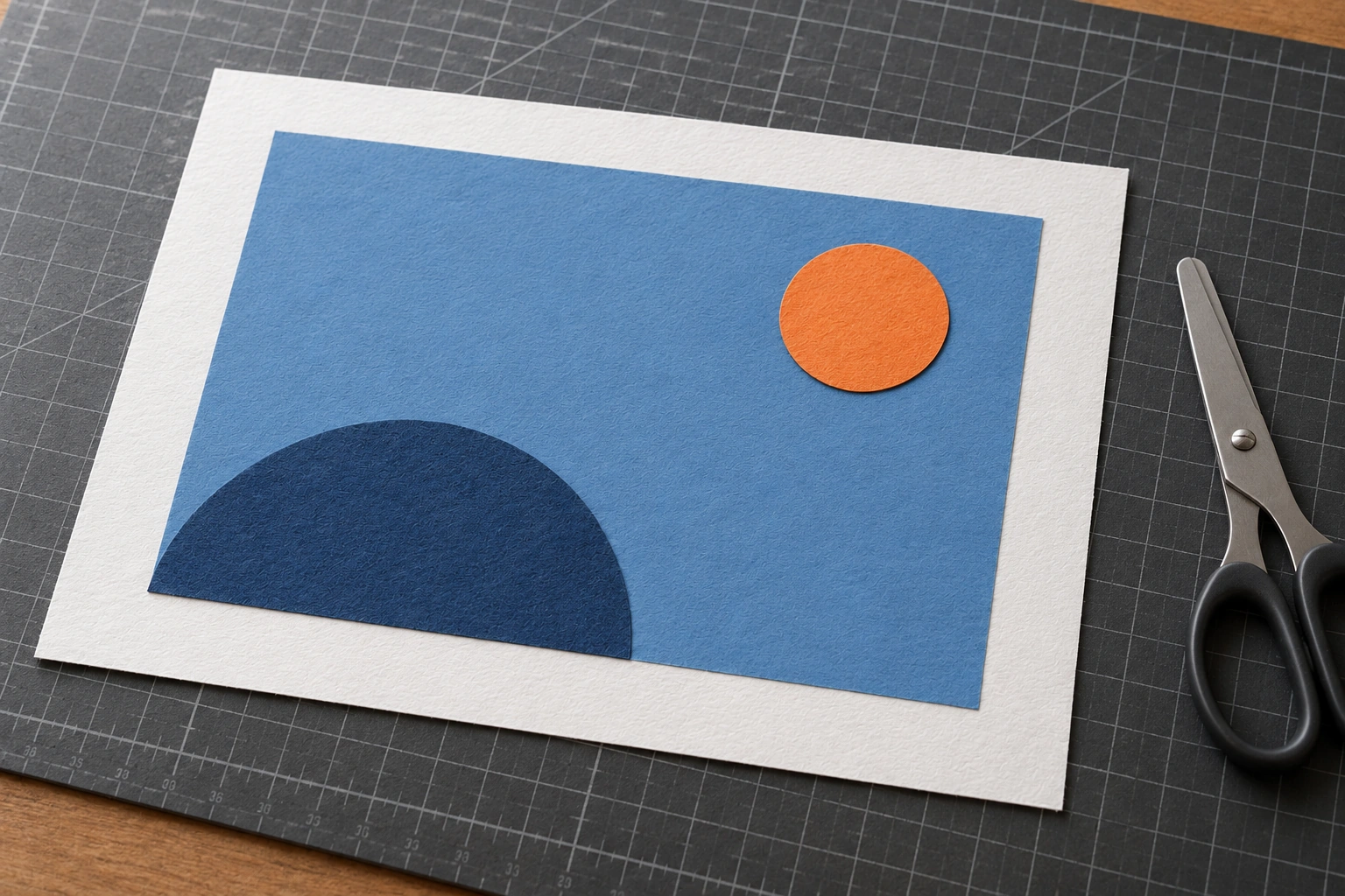
Warm and cool colour relationships can guide attention in a collage, particularly when one colour group becomes an accent against another. To investigate the effect, retain shapes and positions while changing their colour relationship. Do not assume a warm colour automatically becomes the focus of every image.
Size, lightness, saturation and placement also affect focus. This exercise deliberately limits some variables so colour relationships are easier to observe. Results may differ with the paper selected and the way forms are arranged.
Prepare matching shapes for two versions
Choose a few simple forms, perhaps a small circle and two larger areas. Make two sets with the same shapes and dimensions. Use similar bases so a format change does not complicate the comparison.
Select colours from available materials. A warm group might use orange or red, while a cool group might use suitable blues or greens. Compare colours alongside each other because their effect depends on context.
Do not glue immediately. Test the arrangement so positions can remain the same in the second version. Make a note or light guide marks to place the small circle consistently.
Try a warm accent on a cool field
Arrange a larger cool field and add a smaller warm accent. Observe whether attention moves to that accent or stops elsewhere. Ask what you notice first before reading your own explanation of the plan.
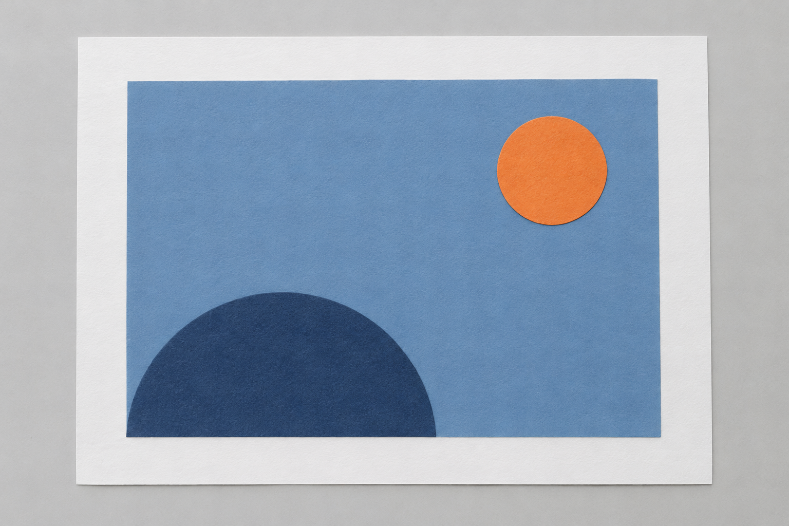
An orange circle against blue supplies one relationship to observe. Do not enlarge the accent while claiming to test only colour: increasing the circle introduces another variable.
Notice edges where shapes meet. Empty space, distance from the border and nearby forms can strengthen or weaken focus. Record those conditions rather than immediately adding decoration to make the image busier.
Reverse the colour relationship without changing shapes
Make a second version with a broad warm field and a small cool accent. Keep shape, size and position as consistent as possible. The aim is a comparison, not an unrelated new composition.
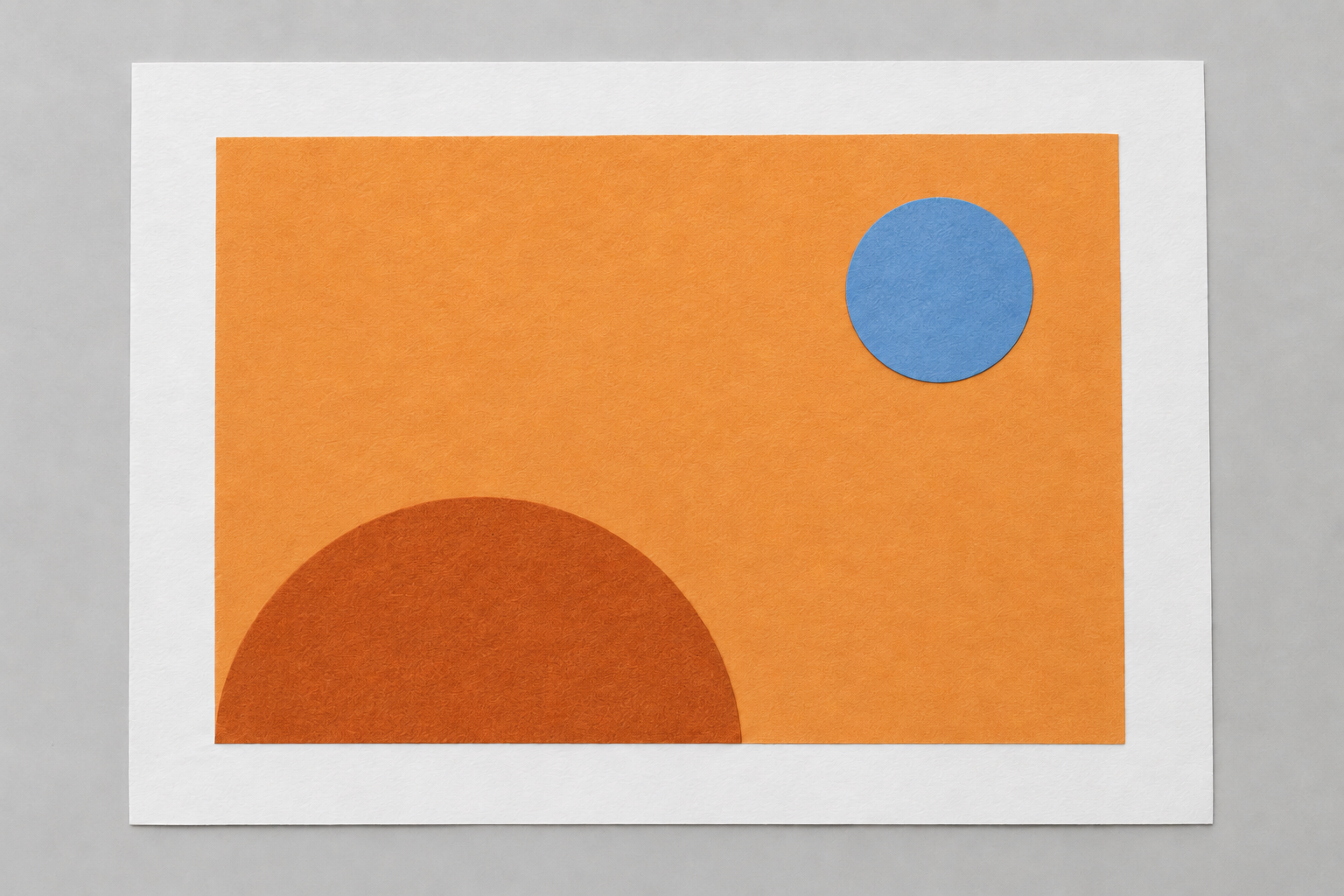
Place the versions side by side. A cool accent can also attract attention through contrast with its surroundings. This shows why “warm always advances and cool always recedes” does not explain every viewing experience.
Rio Hondo College’s collage material provides context for exploring colour temperature. Use the exercise to observe the relationship you create rather than prove that everyone must identify the same focus.
Check other variables that changed
| Variable | Keeping the comparison useful |
|---|---|
| Shape | Use cutouts with matching contours |
| Accent area | Retain the circle’s size in both versions |
| Position | Place the accent in the same location |
| Lightness | Notice whether one colour is much lighter |
| Saturation | Record a markedly stronger or duller paper |
| Surface | Use similar material so gloss does not dominate |
If the second version feels different, examine what actually changed. Glossy and matte papers can attract attention differently even if both are called blue. Do not attribute every difference to colour temperature.
Perfect control is not necessary for learning. State the comparison’s limits honestly in your own notes, then make another attempt if a question remains. This makes a small exercise useful without pretending it establishes a universal rule.
Choose focus from the image’s purpose
After comparing, choose the version that serves the collage’s intention. The focus might be a main object, movement direction or an area to discuss. Colour supports that intention rather than acting as decoration that must fill every space.
Glue after the arrangement is settled. Use adhesive suited to the material and smooth the paper without damaging its texture. If the accent’s area changes while gluing, recognise that the final image is no longer exactly the same comparison.
Ask someone to look without prompting them first. Which part do they notice and why? Their response tests readability rather than establishing a taste everyone must follow.
Keep the two versions together when discussing the result. A note such as “same shapes and position, reversed warm/cool relationship” helps another viewer understand the question. A single final image hides that useful part of the process.
For a later attempt, choose one additional change, such as reducing the accent within the same version. Compare again before replacing other colours. This sequence lets you discuss the effect of area without mixing it with a completely new palette. It also preserves what worked in the original attempt rather than restarting every decision at once.
For depth relationships, read paper collage with overlap. When learning with Zumen, bring both versions and notes about the changed variable. Colour experiments become more useful when attention connects to decisions that can be compared.